History of the Canarian flag (VI)
The Canarias Libre movement
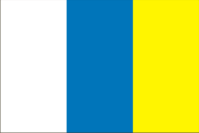
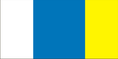
The Canarias Libre (Free Canaries) movement was created in 1961 by a group of Gran Canaria lawyers and young professionals, one of the most prominent members being Fernando Sagaseta. Other militants, Carmen Sarmiento an her sons Arturo and Jesus Cantero Sarmiento, being unaware of the preceding flags, designed a tri-colour flag made up of three vertical stripes of equal size, in the colours white, blue and yellow. Again this design combines the representative colours of the two provinces, but in such a way that it reproduces their situation on the map, that is, Santa Cruz de Tenerife (white and blue), on the left as the western province, and Las Palmas (blue and yellow) on the right as the eastern province.
Surely ignorant of the fact, the creator of this flag followed the same cartographic criterion of that of the Ateneo of La Laguna, albeit changing the stars by the chromatic representation. By this means the conflict over which colours should prevail was avoided, unlike with the proposals of the MIC and RIA. Subsequently Fernando Sagaseta tried to add an ideological explanation to the chosen design, by saying that the revolutionary flags always had their stripes vertically placed, while the monarchists ones were horizontal. An argument which is obviously groundless.
This tri-colour flag, in the form of paper sheets, twice the length of its width, was scattered around by its creator and other CL members in the town of Teror, Gran Canaria, on 8 September 1961, during the feast of the Virgen del Pino (Our Lady of the Pine-tree), patron saint of Gran Canaria. The sheets had no explanatory text, and in spite of that they were spontaneously recognized by the public as the Canarian flag. There has been some disagreement over if the three stripes all had the same width or if the blue band was wider. All seems to indicate that if the first exemplars showed a central wider band, this was due simply to a defect in the cutting of the sheets on which they were printed. It is not very clear either the shade of blue, navy or sky blue, but it seems that this was a detail not greatly considered by the author, and in subsequent copies there was no uniformity, but a more or less dark navy blue prevailed.


